Much of U.S. to be Warmer than Normal

Much of the United States is expected to be warmer than normal this summer. Some drought may also be on the way for parts of other desert southwest. Read on for more information.

U.S. Temperature Outlook (July - September 2012)

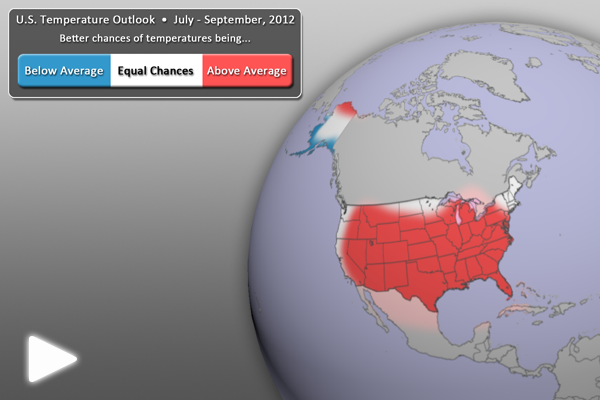
U.S. Temperature Outlook (July – September 2012) • Click for Full-Earth animation

      • With the absence of La Niña, temperatures are rebounding.
      • For the July – September period, warmer than normal temperatures are expected across most of the contiguous United States. Because of low soil moisture amounts in the southwest and mid-Mississippi River valley, temperatures are likely to be warmer than average.
      • The west coasts of Alaska are the only U.S. locations expected to be cooler than normal. This is likely due to the cooler than normal SSTs in this region.
      • All other locations (in white) have equal chances of being warmer or cooler than normal.
      • Outlook by NOAA’s Climate Prediction Center (CPC)
      • In its forecasts, the CPC uses a wide variety of models in conjunction with looking at climate variables (like La Niña).
      • It should be noted that areas in the “warmer than normal” region may still have cooler than normal days. This outlook only suggests that after the three months are over, those areas in the “warmer than normal” region are more likely to have experienced warmer than normal average temperatures.
U.S. Precipitation Outlook (July - September 2012)

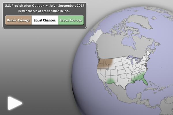
U.S. Precipitation Outlook (July – September 2012) • Click for Full-Earth animation

  • For the next three months (July – September), drier than normal conditions are expected for the Pacific Northwest, reaching as far east as western Montana.
  • Wetter than normal conditions are expected in the extreme southern portions of the desert southwest, likely due to increased monsoonal moisture. The southeast U.S. is also expected to be wetter than normal, due in part to warm waters in the Gulf of Mexico.
  • All other locations (in white) have equal chances of being wetter or drier than normal.
  • Outlook by NOAA’s Climate Prediction Center (CPC)
  • In its forecasts, the CPC uses a wide variety of models in conjunction with looking at climate variables (like La Niña).
  • It should be noted that areas be in the “drier than normal” region may still have rainy days. This outlook only suggests that after the three months are over, those areas in the “drier than normal” region are more likely to have experienced drier than normal averages.

Where do I find the datasets?

  • First, check your SOS system to make sure they are not already in the EarthNow category. There is also an earthnow.sos playlist file that includes a playlist with all of these datasets.
  • If not, you can download the datasets and playlist files from this FTP Site.

Helpful Resources for More Information

Credit(s):
CIMSS/SSEC, UW-Madison
References:
NOAA Climate Prediction Center, 3-month Outlook, http://www.cpc.ncep.noaa.gov/
Category: U.S. Outlook
Tags: , ,
0 Comments

May 2012 Second Warmest on Record

After the fifth warmest April on record, the combined global land and ocean temperature for May 2012 was 0.66°C (1.19°F) above the 20thcentury average of 14.8°C (58.6°F), making it the 2nd warmest May on record (since 1880), only behind May 2010.

May 2012 Global Temperature Anomalies

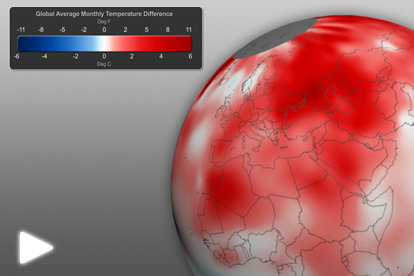
May 2012 Global Temperature Anomalies • Click to watch Full-Earth animation

Much of the well above-average land temperatures were concentrated on Earth’s land areas, making the May’s global land area the warmest on record. Most areas of the world experienced much warmer-than-average monthly temperatures, including nearly all of Europe, Asia, northern Africa, most of North America and southern Greenland. Only Australia, Alaska and parts of the western U.S.-Canadian border region were notably cooler than average. Further, the Northern Hemisphere experienced its warmest combined land and ocean May temperature on record. Lastly, the combined global land and ocean average surface temperature for January–May 2012 was the 11th warmest on record.

Stay tuned for more May 2012 climate information in the coming days.

Helpful Resources for More Information

Credits:
Dan Pisut, NOAA Environmental Visualization Lab
Patrick Rowley, Cooperative Institute for Meteorological Satellite Studies
References:
NOAA National Climatic Data Center, State of the Climate: Global Analysis for May 2012, published online June 2012, retrieved on June 14, 2012 from http://www.ncdc.noaa.gov/sotc/global/2012/5.
Category: Atmosphere
Tags: ,
1 Comment

New Sea Surface Temperature Dataset!

New SST Dataset

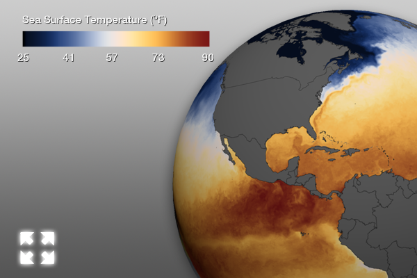
New SST Dataset • Click for Full-Earth image

As Dan Pisut mentioned a little while ago, the real-time Sea Surface Temperature (SST) dataset for Science On a Sphere has been tweaked a bit, having a new color scale and higher definition, both providing for more detail. As a reminder, here is what Dan mentioned in his email to the SOS Network:


“NOAA recently developed a higher resolution daily product that we’re processing for the SOS.  In fact, the imagery is downsized from its native 7200×3600 pixels (if you’d like the full imagery for other projects, just email me).  Besides the higher resolution, we have modified the color scheme to better align with the best practices for content development, still be intuitive, and better enhance features like currents.  The archive is being updated so that the color is consistent over time.”

Well, now that the new real-time SST visualization has some more detail, we thought it would be good to go into a little detail about what you are seeing via EarthNow.

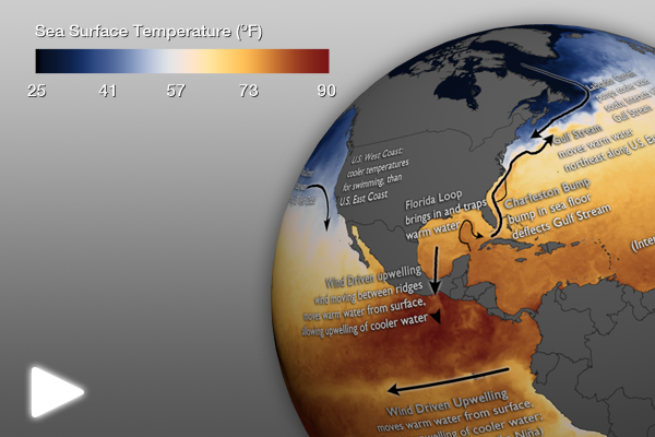
Labeled SST

Labeled SST • Click for Full-Earth animation

Labeled SST Map

To help with visualizing some of what’s to be described, we’ve created two annotated datasets. The first is one frame (one still image) from the new SST dataset. It’s labeled with various currents and other features. While movement of water could be seen on the older SST imagery, the new dataset more clearly illustrates the relationship between the ocean’s surface currents and temperature. To keep the blog text at a minimum, any of the information regarding each feature is displayed on the image itself. Click on the image above to open a Full-Earth image and see the details.

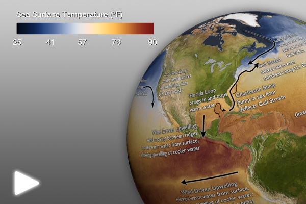
Labeled SST with Topography

Labeled SST with Topography • Click for Full-Earth animation

Labeled SST Map with Topography

Some of the currents and features labeled on the previous map are affected by the topography of the ocean floor (bathymetry) or topographical land features. This visualization is the same, but has a topographic map under the SST data. Again, by clicking on the image to the left, a Full-Earth image will open to better see the labels and map detail.

Presentation Ideas:

  • Show real-time SST animation dataset (no labels) and ask audience to look for temperature patterns and movements.
  • Then, show the labeled SST image and/or the labeled SST with topography image to further explain some of the temperature patterns and movements.

Where do I find the datasets?

  • First, check your SOS system to make sure they are not already in the EarthNow category. There is also an earthnow.sos playlist file that includes a playlist with all of these datasets.
  • If not, you can download the datasets and playlist files from this FTP Site.
Credits:
Dan Pisut, NOAA Environmental Visualization Lab
Patrick Rowley, Cooperative Institute for Meteorological Satellite Studies
References:
CIMAS, The Agulhas Current, http://oceancurrents.rsmas.miami.edu/indian/agulhas.html
CIMAS, The Labrador Current, http://oceancurrents.rsmas.miami.edu/atlantic/labrador.html
NOAA, A Profile of the Charleston Bump, http://oceanexplorer.noaa.gov/explorations/islands01/background/islands/sup11_bump.html
Category: Oceans
Tags: , ,
2 Comments