According to an inventory maintained by the United Nations Office for Outer Space Affairs (UNOOSA), there are over 8000 individual satellites orbiting Earth. This animation depicts approximately 7300 of the active satellites in April 2023.
The blue dots depict Low Earth Orbiting satellites, traveling from pole-to-pole.
The red dots depict Geostationary Earth Orbiting satellites, seemingly stationary above Earth’s equator but orbiting at the same rate of Earth’s rotation.
The yellow dots depict Medium Earth Orbiting satellites, commonly used by navigation systems.
On January 15th 2022, an underwater volcano erupted in the South Pacific Ocean blasting steam, ash, and sulfur dioxide to record heights. The explosive eruption of Hunga Tonga-Hunga Ha’apai created a sonic boom heard as far north as Alaska. It also triggered a tsunami that destroyed homes on nearby islands before crossing the ocean to the coasts of Japan and North and South America. The Hunga-Tonga eruption was so powerful that it sent a rare pressure wave rippling around the world.
NOAA’s GOES-17 and Japan’s Himiwari-8 geostationary satellites were perfectly positioned to observe and document the historic event. A team of scientists used the satellite data to determine that the volcanic plume soared through the troposphere and stratosphere into the mesosphere to a height of 36 miles, or 58 kilometers high. That’s two and a half times higher than any thunderstorm ever observed. Even satellites in the ionosphere – which borders on the edge of space – detected unusual electric currents and hurricane-speed winds associated with this intense volcanic event.
The atmospheric pressure wave generated by the Hunga-Tonga eruption circled Earth for several days. This model animation shows the shock wave pattern as it propagated around the planet.
Satellite sensors detected the travelling pressure wave via temperature changes in mid-level atmospheric water vapor imagery, seen in this animation that stitches data together from multiple geostationary satellites.
The reverberating shock waves were unlike anything seen in the modern satellite era. They spread outward in concentric rings from the South Pacific volcano and crisscrossed the globe multiple times.
Pressure sensors on the ground also captured the passage of the wave. Similar to satellites, surface observing systems measured changes in pressure for several days as successive waves rippled and crossed in their journey around the planet.
From below the surface of the sea to the edge of space and every layer of the atmosphere in-between; the vast amounts of data collected from the 2022 Hunga-Tonga volcano eruption ensure that scientists will be studying this historic event for years to come.
How to Use in Presentation This video provides the foundation for any Earth orientated Science On a Sphere presentation on volcanoes and satellites, or may be used as a stand-alone in automated SOS programming.
This video was a collaborative effort between NOAA’s Cooperative Institute for Meteorological Satellite Studies (CIMSS), the Space Science and Engineering Center (SSEC) and NOAA’s Advanced Satellite Product Branch (ASPB) co-located at the at the University of Wisconsin-Madison with support from the GOES-R Program.
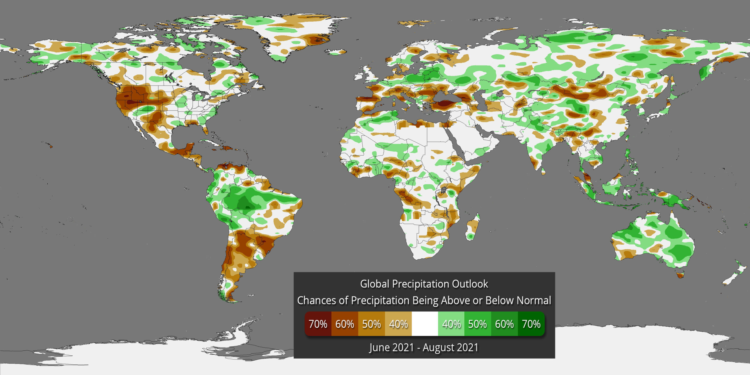
The data for the global temperature and precipitation outlooks are provided by the International Research Institute for Climate and Society (IRI). The IRI was established as a cooperative agreement between NOAA’s Climate Program Office and Columbia University. It is part of The Earth Institute, Columbia University. These maps are constructed primarily with data from NOAA climate models, with some minor tweaks by climatologists.
Temperature Outlook
What does RED mean on the map? The red and orange shading on the map indicates areas that have a higher probability (greater than 35%) of being “warmer than normal”, than “normal”, or “cooler than normal”.
What does BLUE mean on the map? The blue shading on the map indicates areas that have a higher probability (greater than 35%) of being “cooler than normal”, than “normal”, or “warmer normal”.
WHITE indicates areas that have a higher probability of being “normal” than “cooler or warmer than normal” and also, areas where the chances for being cooler than normal, warmer than normal, and normal are equal.
It should be noted that areas in the “warmer than normal” region may still have cooler than normal days, and may not be “hot”. This outlook only suggests that after the three months are over, those areas in the “warmer than normal” region are more likely to have experienced warmer than normal average temperatures.
Precipitation Outlook
What does GREEN mean on the map? The green shading on the map indicates areas that have a higher probability (greater than 35%) of being “wetter than normal”, than “normal”, or “drier than normal”.
What does BROWN mean on the map? The brown shading on the map indicates areas that have a higher probability (greater than 35%) of being “drier than normal”, than “normal”, or “wetter than normal”.
WHITE indicates areas that have a higher probability of being “normal” than “drier or wetter than normal” and also, areas where the chances for being drier than normal, wetter than normal, and normal are equal.
It should be noted that areas in the “wetter than normal” region may still have drier than normal days, and may not be “flooded”. This outlook only suggests that after the three months are over, those areas in the “wetter than normal” region are more likely to have experienced wetter than normal average rainfall.