April 2012 5th Warmest April on Record

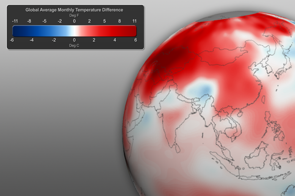
After the coolest March since 1999 (note: still above average), the combined global land and ocean temperature for April 2012 was 0.65°C (1.17°F) above the 20th century average of 13.7°C (56.7°F), making it the 5th warmest April on record.

April 2012 Global Temperature Anomalies

April 2012 Temperature Anomalies • Click graphic for Full-Earth image

Much of the well above-average land temperatures were concentrated on Earth’s land areas, making the April’s global land area the 2nd warmest on record (after April 2007). Some highlights include warmer than normal temperatures across Russia, the United States, Alaska, and parts of the Middle East and western Europe. On the other hand, the United Kingdom experienced its coolest April since 1989. Lastly, April 2012 marks the 326th consecutive month with a global temperature above the 20th century average.

Stay tuned for more April 2012 climate information in the coming days.

Helpful Resources for More Information

Credits:
Dan Pisut, NOAA Environmental Visualization Lab
Patrick Rowley, Cooperative Institute for Meteorological Satellite Studies
References:
NOAA National Climatic Data Center, State of the Climate: Global Analysis for April 2012, published online May 2012, retrieved on May 15, 2012 from http://www.ncdc.noaa.gov/sotc/global/.
Category: Climate Digest
Tags: , , ,
1 Comment

March Climate Digest

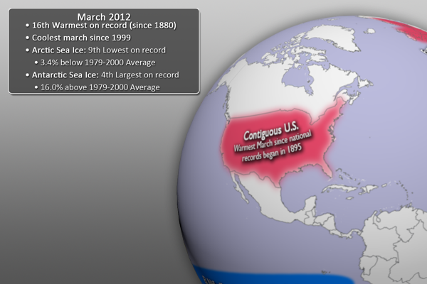
Each month, around the middle of the month, we will provide information regarding the previous month’s climate, as well as the U.S. seasonal outlook for the coming months. Overall, preliminary data analysis suggests that March 2012 was the 16th warmest March on record (since 1880). Interestingly, it was also the coolest March since 1999. Major stories include a warm contiguous United States and Europe and weakened La Niña. More detailed information follows:

**Note: We’re trying out something new this time around! If you click on the March 2012 Highlights graphic below, you should have a video version of the dataset start playing. Hopefully, this will allow you better visualize what this will look like on a Science On a Sphere. Let us know what you think.**

March 2012 Highlights Graphic

March 2012 Highlights • Click graphic for Full-Earth animation

March 2012 Highlights

  • This dataset shows some of the major March climate highlights from the National Climatic Data Center’s (NCDC) monthly global climate analysis. The events are noted below with more information.
  • El Niño/Southern Oscillation (ENSO): The cooler than average waters in the eastern central Pacific Ocean have continued to moderate, signaling a very weak La Niña. ENSO is expected to become “neutral” by May 2012. Click here for more information about La Niña and how it may impact the climate outlook for the coming months.
  • United States (contiguous): Most of the country experiences record breaking, or near record breaking temperatures (maximums and minimums). This led to the warmest March since national records began in 1895.
  • Europe: After a bitterly cold January and February, much of Europe experienced unusually warm temperatures, including the warmest March on record for Norway. The United Kingdom, Austria, and Germany all had their third warmest March, while Denmark experienced its fourth warmest March.
  • Australia: Australia experienced its fourth wettest March in the nation’s 113-year record.
March 2012 SST Anomaly Graphic

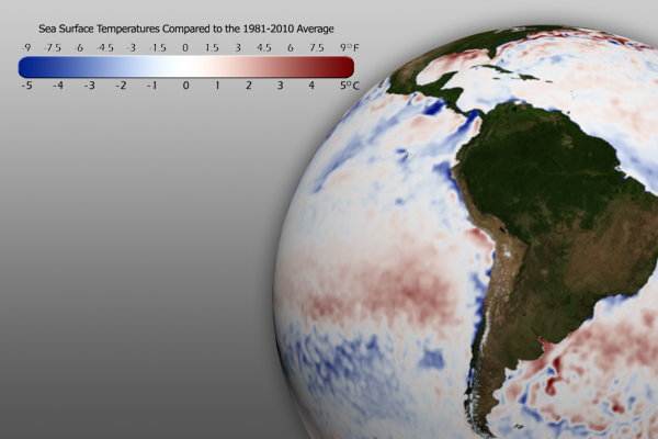
March 2012 SST Anomaly • Click graphic for Full-Earth image

Sea Surface Temperature Anomaly

  • The real-time sea surface temperature anomaly dataset is a great way to visualize moderating water temperatures in the eastern central Pacific ocean. This indicates the weakening La Niña pattern mentioned above.
  • Remember that the blues indicate cooler than average temperatures and reds indicate warmer than average temperatures (white: average).
March 2012 Global Temperature Graphic

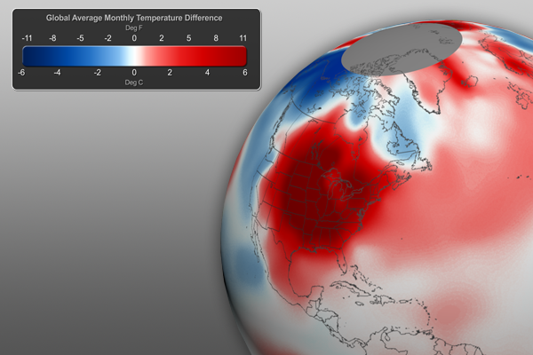
March 2012 Temperature Anomalies • Click graphic for Full-Earth image

Global Temperature Anomalies

  • Using the real-time Monthly Temperature Anomalies dataset is a great way to convey where some of the warmer and cooler than average areas were in March.
    • The combined global land and ocean average surface temperature for March 2012 was the 16th warmest on record (and coolest since 1999) at 13.16˚C (55.73˚F), which is 0.46˚C (0.83˚F) above the 20th century average.
    • It should be noted that “March 2012 marks the 36th consecutive March and 325th consecutive month with a global temperature above the 20th century average. The last March with below-average temperature was March 1976 and the last month with below-average temperature was February 1985.” [NCDC]
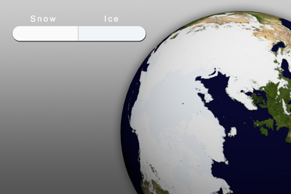
March 2012 Snow and Ice Graphic

March 2012 Snow and Ice • Click graphic for Full-Earth image

Snow and Ice…

  • Aside from helping to illustrate seasonal changes, the real-time Snow and Ice Cover dataset is a great way to convey sea ice change through time, including discussing how the current sea ice extent compares to other noteworthy years.
  • The Arctic sea ice extent in February was the ninth lowest on record. The extent was 3.4% below the 1979-2000 average.
  • In Antarctica, the January sea ice extent was the 4th largest on record, at 16.0% above the 1979-2000 average.
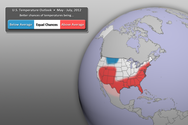
U.S. Temperature Outlook Graphic

U.S. Temperature Outlook, May - July, 2012

U.S. Temperature Outlook

  • Weakening La Niña conditions are expected to influence the U.S. temperature outlook (see below).
  • For the May – July period, warmer than normal temperatures are expected across much of the southern part of the country, up along the east coast, and into the four corners region.
  • By contrast, cooler than normal temperatures can be expected for Montana and the areas surrounding that state.
  • All other locations (in white) have equal chances of being warmer or cooler than normal.
  • Outlook by NOAA’s Climate Prediction Center (CPC)
  • In its forecasts, the CPC uses a wide variety of models in conjunction with looking at climate variables (like La Niña).
  • It should be noted that areas in the “warmer than normal” region may still have cold winter days. This outlook only suggests that after the three months (April, May, and June) are over, those areas in the “warmer than normal” region are more likely to have experienced warmer than normal average temperatures. The same is true for the “cooler than normal” and “equal chances” regions.
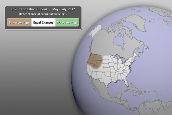
U.S. Precipitation Outlook Graphic

U.S. Precipitation Outlook, May - July, 2012

U.S. Precipitation Outlook

  • For the next three months (May – July), drier than normal conditions are expected for the Pacific Northwest, reaching as far east as Wyoming and Montana.
  • Wetter than normal conditions are not expected anywhere.
  • All other locations (in white) have equal chances of being wetter or drier than normal.
  • Outlook by NOAA’s Climate Prediction Center (CPC)
  • In its forecasts, the CPC uses a wide variety of models in conjunction with looking at climate variables (like La Niña).
  • It should be noted that areas be in the “drier than normal” region may still have rain and snow storms. This outlook only suggests that after the three months (April, May, and June) are over, those areas in the “drier than normal” region are more likely to have experienced drier than normal averages. The same is true for the “wetter than normal” and “equal chances” regions.

Helpful Resources for More Information

Where do I find the datasets?

  • First, check your SOS system to make sure it’s not already in the EarthNow category. There should also be an ‘earthnow.sos’ playlist file (you’ll need to add that to your sosrc folder).
  • If not, you can download the datasets and playlist.sos files from this FTP Site.
Reviewed by:
Matthew Rosencrans, Meteorologist, NOAA Climate Prediction Center
Beth Russell, NOAA Earth Systems Research Lab
Credits:
Dan Pisut, NOAA Environmental Visualization Lab
Patrick Rowley, Cooperative Institute for Meteorological Satellite Studies
References:
NOAA Climate Prediction Center, http://www.cpc.ncep.noaa.gov/
NOAA Climate Prediction Center, Prognostic Discussion for Long-Lead Seasonal Outlooks, http://www.cpc.ncep.noaa.gov/products/predictions/90day/fxus05.html
NOAA National Climatic Data Center, State of the Climate: Global Analysis for March 2012, published online April 2012, retrieved on April 19, 2012 from http://www.ncdc.noaa.gov/sotc/global/.
Category: Climate Digest
Tags: , , , , , , ,
0 Comments

Early March Tornado Outbreak

About a month ago, a large tornado outbreak devastated parts of the South and Ohio River Valley. Over 120 tornadoes (preliminary numbers) were reported, along with over 500 other severe weather reports, including hail and high winds. Unfortunately, this storm system also resulted in at least 39 fatalities. For this week’s EarthNow post, we’re going to take a closer look at how the storm system evolved and created such destructive and deadly tornadoes.
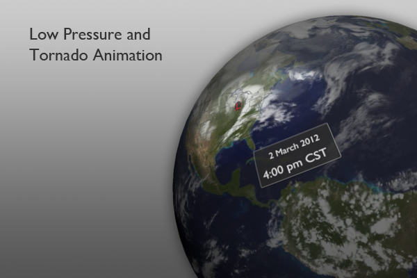
Low Pressure and Tornado Animation GraphicStorm System Animation

Visualization Description: This first visualization is an animation of IR satellite imagery over a 48-hour period. The animation starts at 6pm CST on March 1, 2012, the day before the massive early-season tornado outbreak. As the animation approaches March 2, the area of interest is highlighted. A clock will also appear and be displayed for the entirety of March 2nd. As the animation progresses, a low pressure “L” symbol will also move across the area of interest from about 7am through 9:30pm CST, the time period that most of the storm activity occurred. Following the low pressure movement, red dots, representing tornado reports, appear along with a gray base map. For SOS veterans, it should be noted that the IR animation will seem particularly slow. I slowed it down a lot to allow time to see the relatively fast moving storm system.

About the Data: It’s possible that the warmer than normal winter in much of the U.S. contributed to this earlier than normal severe weather outbreak. Weather and climate scientists suggest that warmer than normal sea surface temperatures (about 1˚C above normal) across the Gulf of Mexico played a part in fueling the severe weather. As warm moist air moved northward out of the Gulf of Mexico, cold dry air moved southeast out of Canada. You can even see the cold front in the IR satellite imagery, draping southwest from the low pressure symbol.

As the cold dry air at higher altitudes and warm moist air collide, the atmosphere became very unstable. Moist air (and warm air) is less dense than the cold dry air and is therefore forced upward as columns of air into thunderstorms, called updrafts. At this point, we still don’t have tornadoes, however. The air in the storms needs to become “twisted” by something called shear, when the winds at various levels of the atmosphere change speed and direction. This is in place this day as well, in part because of an enhanced jet stream. Cue the next dataset!
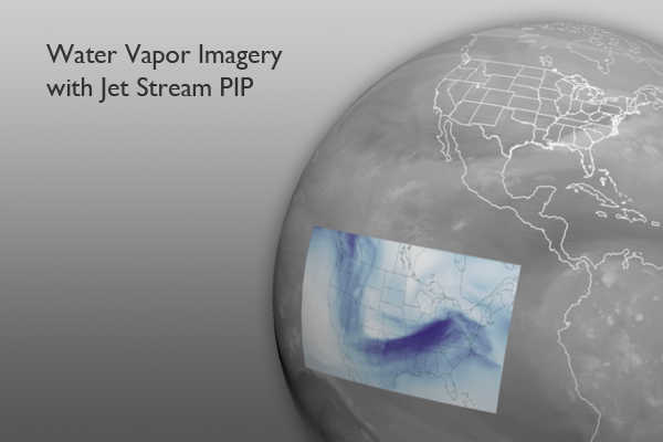
Water Vapor Imagery GraphicWater Vapor Satellite Imagery

Visualization Description: Many of you are probably already familiar with the water vapor satellite dataset. I’ll spare you the details. But, here’s a quick reminder: We’re looking at a higher level of the atmosphere and basically visualizing where dry air is and where moist air is, not necessarily where there are clouds and no clouds. Darker areas indicate dry air where whiter areas indicate moist air. I have also included a PIP of upper level wind speeds. I’ll get to that below.

About the Data:

Water vapor satellite imagery is commonly used by meteorologists to locate the jet stream. Here, we are trying to find the darker (dry air) stream of air forming a U-shape trough across the center of the country. The strongest part moves across the stormy area from southwest to northeast. To help further showcase the jet stream here, the PIP (created by the NOAA Environmental Visualization Lab) for this visualization shows wind speeds at 18,000 feet up in the atmosphere. The image is from 6:00 pm CST. You can clearly see the strongest winds (up to 120 mph) are right over the area with the most storm reports.

These strong upper level winds not only provide the aforementioned shear, but also allow air columns to rise more efficiently into thunderstorms. As air is evacuated above, lower level air is “sucked” up into the storm. You may have noticed how on a windy evening, smoke from your chimney more efficiently rises out up and out. It’s a similar situation here.

All of these conditions are exactly what meteorologists are looking for with regards to severe storm (and tornado) development: instability and lift, shear, and moist air. Having severe weather in early March is not unheard of. Having such severe weather and that many storms in March is definitely rare and may be attributed to the warmer than normal winter for the eastern United States.

Wow! This is a much longer blog post than normal, but isn’t it interesting? This entry will also be posted in the “Earth 101” section of the website for future reference regarding tornadoes. That’s all for now. The next post will be the March Climate Digest.

Other Relevant Resources

Here are some other cool resources regarding severe weather that weren’t necessarily used in this week’s EarthNow post.

The first link is brand new and is regarding the new Dual-Polarization Doppler Radars, currently being installed at National Weather Service Forecast Offices around the country. One great advancement will be even better detection of tornadoes.

Dual-Polarization Radar by NOAA Environmental Visualization Lab

Cooking Up a Storm: an SOS movie by NOAA Severe Storms Lab

Where do I find the datasets?

  • First, check your SOS system to make sure it’s not already in the EarthNow category. There should also be an ‘earthnow.sos’ playlist file (you’ll need to add that to your sosrc folder).
  • If not, you can download the datasets and playlist.sos files from this FTP Site.
Reviewed by:
Stephen Corfidi, Lead Forecaster, NOAA Storm Prediction Center
Credits:
Rick Kohrs, Cooperative Institute for Meteorological Satellite Studies
Dan Pisut, NOAA Environmental Visualization Lab
Patrick Rowley, Cooperative Institute for Meteorological Satellite Studies
References:
AccuWeather, The Science Behind the Tornado Outbreak, http://www.accuweather.com/en/weather-news/the-science-behind-the-tornado/62355
NOAA Environmental Visualization Lab, http://www.nnvl.noaa.gov/MediaDetail2.php?MediaID=1002&MediaTypeID=1
NOAA National Climatic Data Center, State of the Climate: Global Hazards for March 2012, published online April 2012, retrieved on April 5, 2012 from http://www.ncdc.noaa.gov/sotc/hazards/2012/3.
NOAA Storm Prediction Center, http://www.spc.noaa.gov/exper/archive/event.php?date=20120302
Wunderground, Dr. Jeff Masters’ Wunderblog, http://www.wunderground.com/blog/JeffMasters/comment.html?entrynum=2045
Category: Severe Weather
Tags: ,
0 Comments