May 2013 Climate Digest • iPad Video
SOS Playlists
 SOS Playlist
 SOS AutoRun/Audio Playlist
Overview
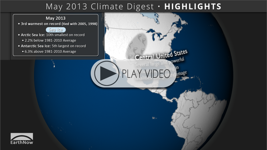
Each month, we will provide information regarding the previous month’s climate. Overall, preliminary data analysis suggests that May 2013 was the 3rd warmest on record, tied with 2005 and 1998 (since 1880). Major stories include severe weather in the United States, wetter than normal Australia and China, and the continued absence of El Niño or La Niña.
May 2013 Highlights • iPad Video
Highlights Dataset
Dataset: 20130620 EarthNow: May 2013 Highlights
Dataset: 20130620 EarthNow: AUDIO May 2013 Highlights
 Full Map Image
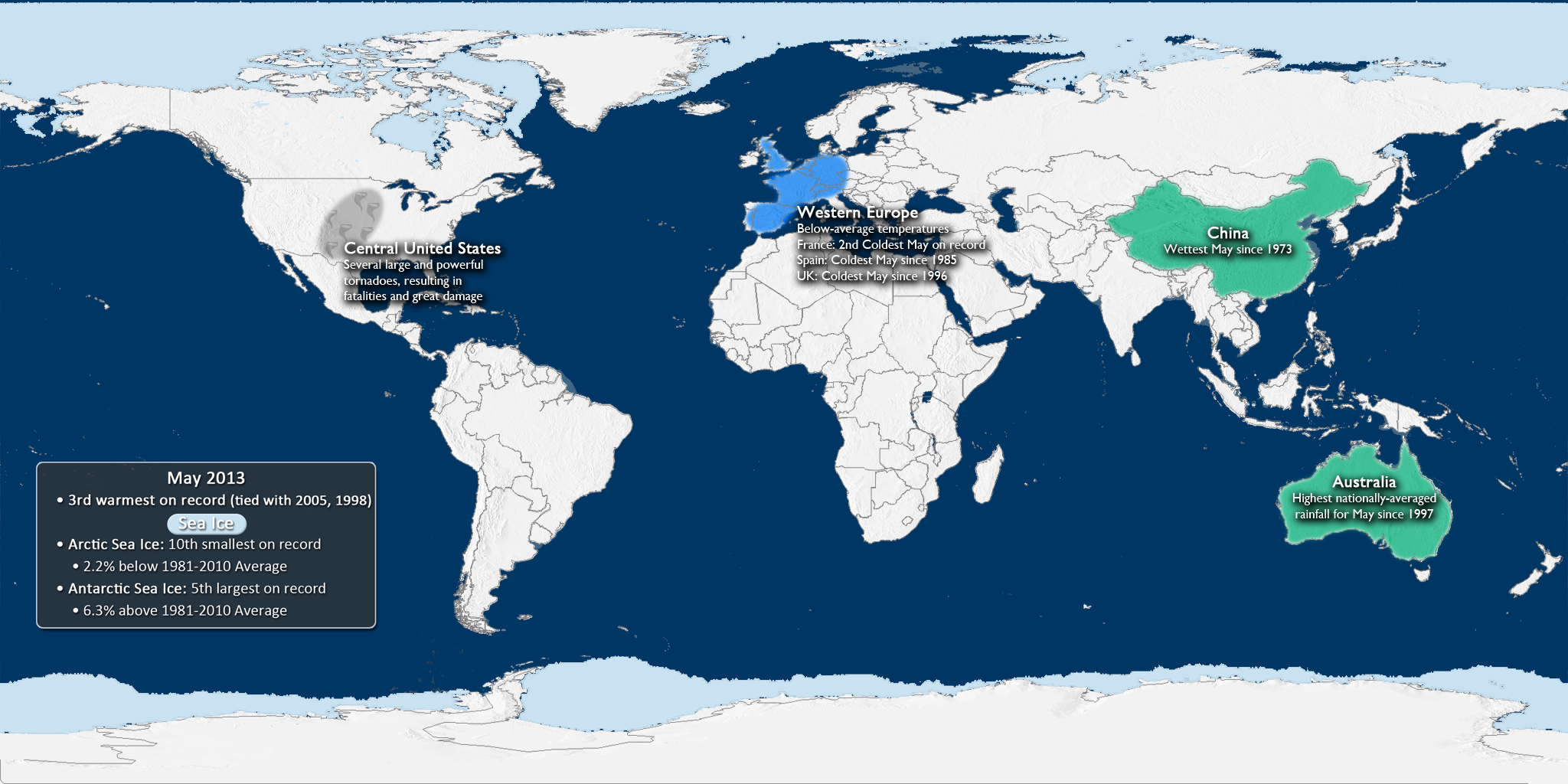
- This dataset shows some of the major May weather and climate highlights from the National Climatic Data Center’s (NCDC) monthly global climate analysis, and serves as an overview of what can be discussed in the datasets that follow. Highlights are noted below with more information.
- United States: The central portion of the United States received several very large and powerful tornadoes, resulting in fatalities and a lot of damage. However, the U.S. had a below-average preliminary tornado count for the month of May.
- Australia: Australia had the highest nationally-averaged rainfall amount for May since 1997.
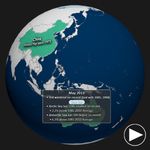
- China: China experienced its wettest May since 1973, with rainfall at 85.5 mm (23% above average).
- Europe: Much of western Europe experienced below-average temperatures in May, including France having its second coldest May on record. Spain experienced its coldest May since 1985, while the United Kingdom had its coldest May since 1996.
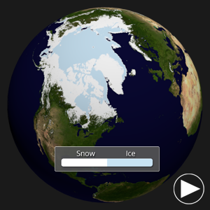
- Arctic Sea Ice Extent: Tenth smallest on record, at 2.2% below the 1981-2010 average.
- Antarctic Sea Ice Extent: Fifth largest on record, at 6.3% above the 1981-2010 average.
May 2013 Temperature Anomalies • iPad Video
Global Temperature Anomalies Dataset
Dataset: 20130620 EarthNow: May 2013 Temperature Anomaly
Dataset: 20130620 EarthNow: AUDIO May 2013 Temperature Anomaly
Full Map Image
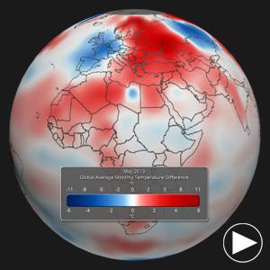
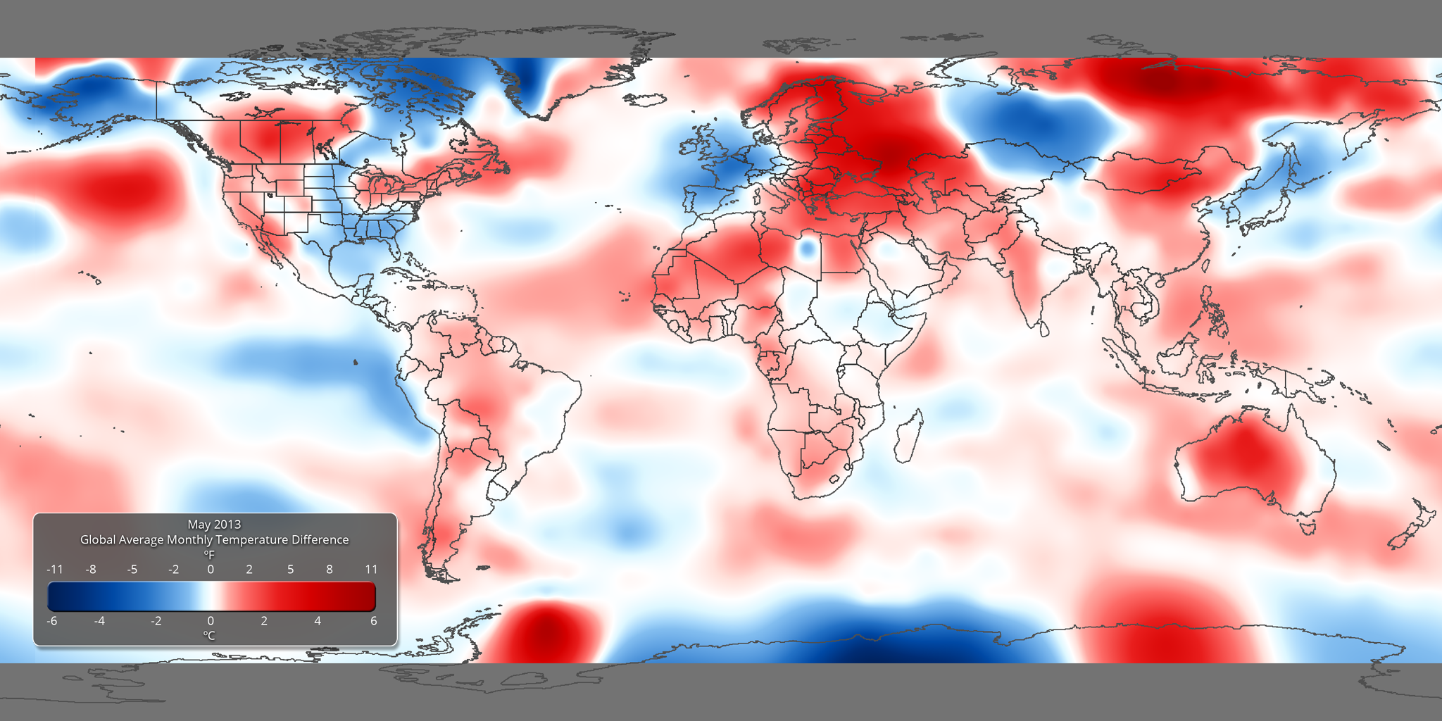
- Using the real-time Monthly Temperature Anomalies dataset is a great way to convey where some of the warmer and cooler than average areas were in May, including those mentioned above in the highlights.
- The combined global land and ocean average surface temperature for May was the 3rd warmest on record, tied with 2005 and 1998 (since 1880).
May 2013 SST Anomalies • iPad Video
Sea Surface Temperature Anomalies Dataset
Dataset: 20130620 EarthNow: May 2013 SST Anomaly
Dataset: 20130620 EarthNow: AUDIO May 2013 SST Anomaly
Full Map Image
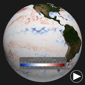
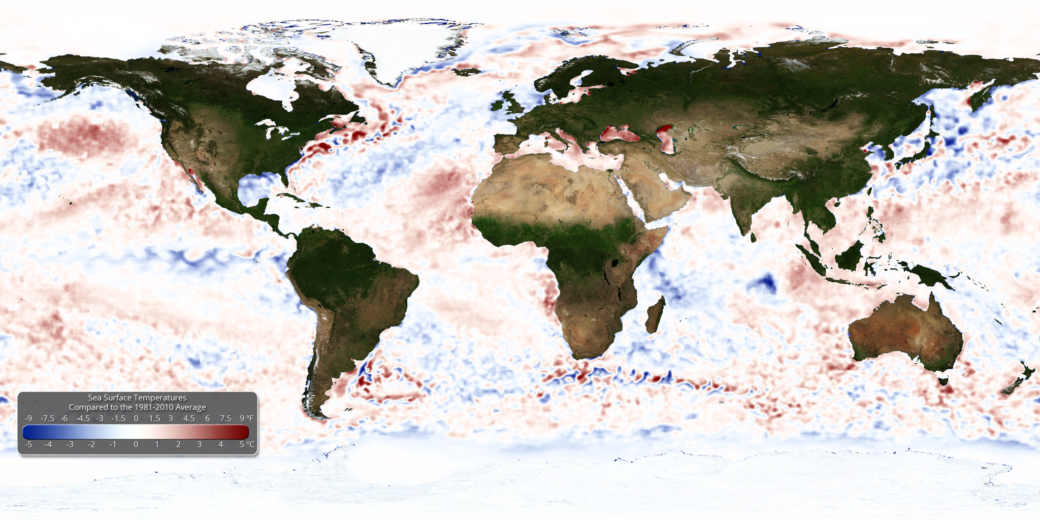
- The real-time sea surface temperature anomaly dataset is a great way to visualize the El Niño – Southern Oscillation (ENSO) cycle in the eastern tropical Pacific ocean. For May 2013, these waters were right around average, indicating an ENSO Neutral period. The Climate Prediction Center anticipates a continued neutral period through at least the northern hemisphere Summer.
- Also of note, the Atlantic ocean temperatures in the development region for tropical cyclones was above normal. This can indicate the potential for an active hurricane season, which just started on June 1.
- Remember that the blues indicate cooler than average temperatures and reds indicate warmer than average temperatures (white: average).
- The Climate Prediction Center expects the neutral conditions to prevail through at least the Northern Hemisphere Summer.
May 2013 Snow and Ice • iPad Video
Snow and Ice Cover Dataset
Dataset: 20130620 EarthNow: May 2013 Snow and Ice Cover
Dataset: 20130620 EarthNow: AUDIO May 2013 Snow and Ice Cover
Full Map Image
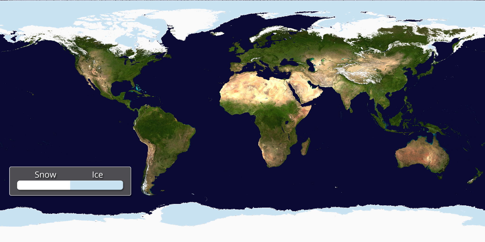
- Aside from helping to illustrate seasonal changes, the real-time Snow and Ice Cover dataset is a great way to convey sea ice change through time, including discussing how the current sea ice extent compares to other noteworthy years.
- The Arctic sea ice extent in May was the tenth smallest on record. The extent was 2.2% below the 1981-2010 average.
- In Antarctica, the sea ice extent was the fifth largest on record, at 6.3% above the 1981-2010 average.
Seasonal Outlooks
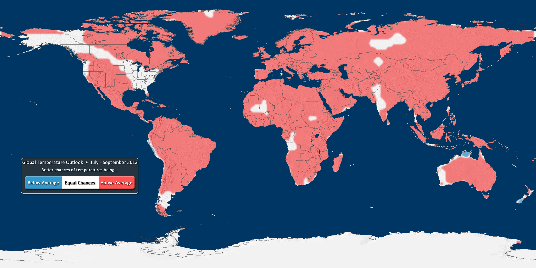
The data for the global temperature and precipitation outlooks are provided by the International Research Institute for Climate and Society (IRI). The IRI was established as a cooperative agreement between NOAA’s Climate Program Office and Columbia University. It is part of The Earth Institute, Columbia University. The data for these maps are constructed primarily from several climate models, with some minor tweaks by climatologists.
Temperature Outlook • iPad Video
U.S. Temperature Outlook
Dataset Name: 20130620 EarthNow: Global Temperature Outlook (July-September 2013)
Still Map Image
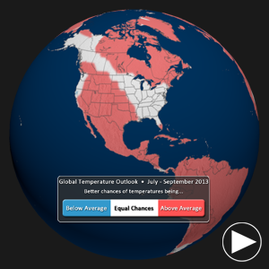
- What does RED mean on the map? The red shading on the map indicates areas that have a higher probability (greater than 35%) of being “warmer than normal”, than “cooler than normal”, or “normal”.
- What does BLUE mean on the map? The blue shading on the map indicates areas that have a higher probability (greater than 35%) of being “cooler than normal”, than “warmer than normal”, or “normal”.
- WHITE indicates areas that have a higher probability of being “normal” than “cooler/warmer than normal” and also areas where the chances for being cooler than normal, warmer than normal, and normal are equal.
- It should be noted that areas in the “warmer than normal” region may still have cooler than normal days, and may not be “hot”. This outlook only suggests that after the three months are over, those areas in the “warmer than normal” region are more likely to have experienced warmer than normal average temperatures.
Precipitation Outlook • iPad Video
U.S. Precipitation Outlook
Dataset Name: 20130620 EarthNow: Global Precipitation Outlook (July-September 2013)
Still Map Image
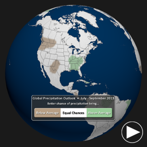
- What does GREEN mean on the map? The green shading on the map indicates areas that have a higher probability (greater than 35%) of being “wetter than normal”, than “drier than normal”, or “normal”.
- What does BROWN mean on the map? The brown shading on the map indicates areas that have a higher probability (greater than 35%) of being “drier than normal”, than “wetter than normal”, or “normal”.
- WHITE indicates areas that have a higher probability of being “normal” than “drier/wetter than normal” and also areas where the chances for being drier than normal, wetter than normal, and normal are equal.
- It should be noted that areas in the “wetter than normal” region may still have drier than normal days, and may not be “flooded”. This outlook only suggests that after the three months are over, those areas in the “wetter than normal” region are more likely to have experienced wetter than normal average rainfall.
Where do I find the datasets?
-
First, check your SOS system to make sure it’s not already in the EarthNow category.
-
If not, you can download the datasets and playlist files from this FTP Site.
-
Then download and use playlist files at the top of the page (or create your own) and make sure they are in /home/sos/sosrc or /home/sosdemo/sosrc.
-
More detailed information here
Helpful Resources for More Information
-
http://go.wisc.edu/3nd6pg National Climatic Data Center (NCDC)
-
http://go.wisc.edu/9y2618 About ENSO (El Niño/La Niña)
-
http://go.wisc.edu/1nx2n3 NCDC’s Global Climate Report
-
http://go.wisc.edu/u7632r About IRI seasonal forecasts
-
http://go.wisc.edu/wuvjkc About IRI seasonal forecast verification
-
http://go.wisc.edu/679k22 IRI seasonal forecasts


