Play video
Overview
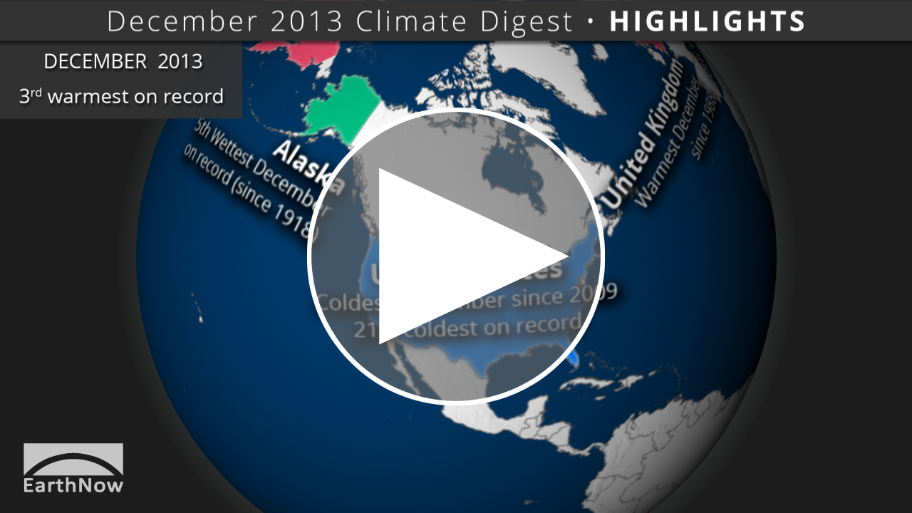
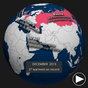
Each month, we will provide information regarding the previous month’s climate. Overall, preliminary data analysis suggests that December 2013 was the third warmest December on record (since 1880). Major stories include a colder than average United States, record-breaking temperatures in Russia, and below average precipitation in Australia.
The data for the global temperature and precipitation outlooks are provided by the International Research Institute for Climate and Society (IRI). The IRI was established as a cooperative agreement between NOAA’s Climate Program Office and Columbia University. It is part of The Earth Institute, Columbia University. The data for these maps are constructed primarily from several climate models, with some minor tweaks by climatologists.
The data for the U.S. drought outlook are provided by NOAA’s Climate Prediction Center.
Play preview
Highlights Dataset
Dataset: 20140122 EarthNow: December 2013 Highlights
Dataset: 20140122 EarthNow: AUDIO December 2013 Highlights
 Full Map Image
- This dataset shows some of the major November weather and climate highlights from the National Climatic Data Center’s (NCDC) monthly global climate analysis, and serves as an overview of what can be discussed in the datasets that follow. Highlights are noted below with more information.
- Argentina: Persistent heat wave during the middle of the month. Several locations broke records.
- United States: Coldest December since 2009, and 21st coldest on record (since 1895).
- Alaska: 5th wettest December since 1918, when records began.
- Australia: Below average precipitation. Queensland had its third driest December on record (since 1900).
- Russia: Warmest November to December period on record (since 1900).
- Israel: Up to 20 inches of snow fell in Jerusalem, which is unusually early and intense.
- Germany: 10th warmest December since records began in 1881.
- United Kingdom: Warmest December since 1988.
Play preview
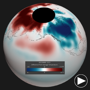
Global Temperature Anomalies Dataset
Dataset: 20140122 EarthNow: December 2013 Temperature Anomaly
Dataset: 20140122 EarthNow: AUDIO December 2013 Temperature Anomaly
Full Map Image
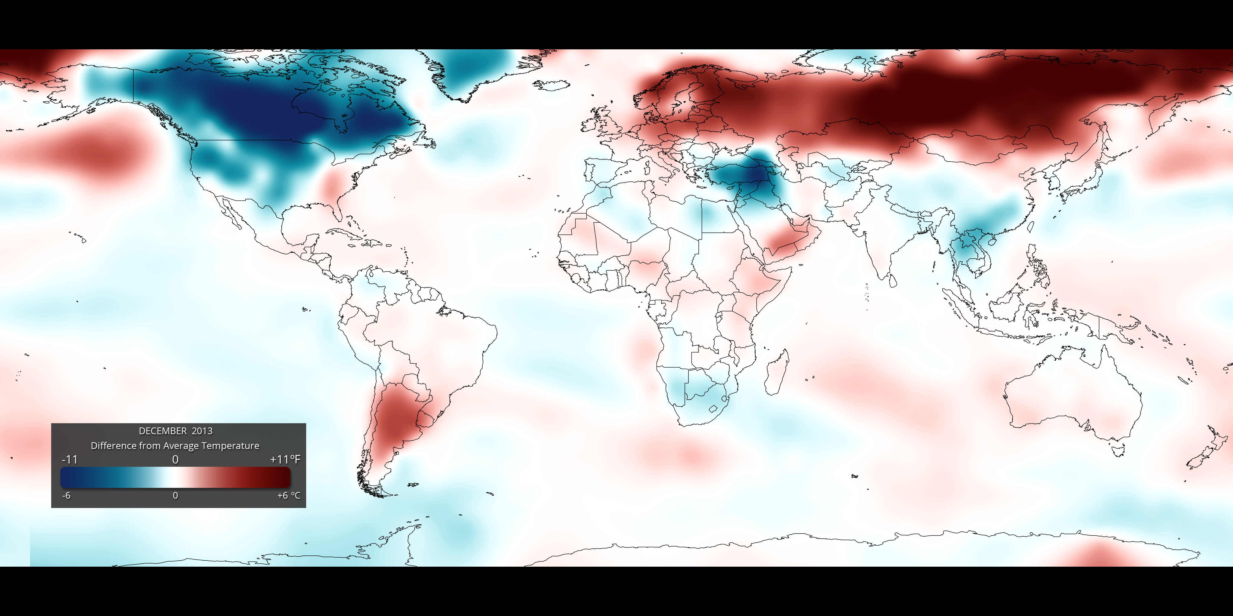
- Using the real-time Monthly Temperature Anomalies dataset is a great way to convey where some of the warmer and cooler than average areas were in December, including those mentioned above in the highlights.
The combined global land and ocean average surface temperature for December was the third warmest on record (since 1880).
Play preview
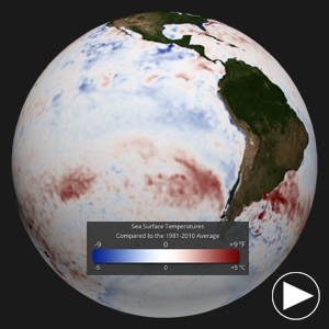
Sea Surface Temperature Anomalies Dataset
Dataset: 20140122 EarthNow: December 2013 SST Anomaly
Dataset: 20140122 EarthNow: AUDIO December 2013 SST Anomaly
- The real-time sea surface temperature anomaly dataset is a great way to visualize the El Niño – Southern Oscillation (ENSO) cycle in the eastern tropical Pacific ocean. For December 2013, these waters hovered near average, indicating an ENSO Neutral period. The Climate Prediction Center anticipates a continued neutral period into the northern hemisphere summer.
- Global water temperatures were the seventh warmest for December on record.
Remember that the blues indicate cooler than average temperatures and reds indicate warmer than average temperatures (white: average).
Play preview
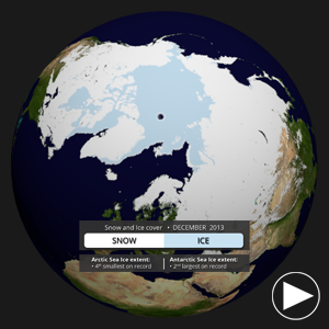
Snow and Ice Cover Dataset
Dataset: 20140122 EarthNow: December 2013 Snow and Ice Cover
Dataset: 20140122 EarthNow: AUDIO December 2013 Snow and Ice Cover
- Aside from helping to illustrate seasonal changes, the real-time Snow and Ice Cover dataset is a great way to convey sea ice change through time, including discussing how the current sea ice extent compares to other noteworthy years.
- The Arctic sea ice extent for December 2013 was the fourth lowest on since satellite records began in 1979.
- In Antarctica, the sea ice extent was the second largest on record.

Click to expand
Temperature Outlook
Dataset Name: 20140122 EarthNow: Global Temperature Outlook (Feb – Apr 2014)
- What does RED mean on the map? The red shading on the map indicates areas that have a higher probability (greater than 35%) of being “warmer than normal”, than “cooler than normal”, or “normal”.
- What does BLUE mean on the map? The blue shading on the map indicates areas that have a higher probability (greater than 35%) of being “cooler than normal”, than “warmer than normal”, or “normal”.
- WHITE indicates areas that have a higher probability of being “normal” than “cooler/warmer than normal” and also areas where the chances for being cooler than normal, warmer than normal, and normal are equal.
- It should be noted that areas in the “warmer than normal” region may still have cooler than normal days, and may not be “hot”. This outlook only suggests that after the three months are over, those areas in the “warmer than normal” region are more likely to have experienced warmer than normal average temperatures.
Click to expand
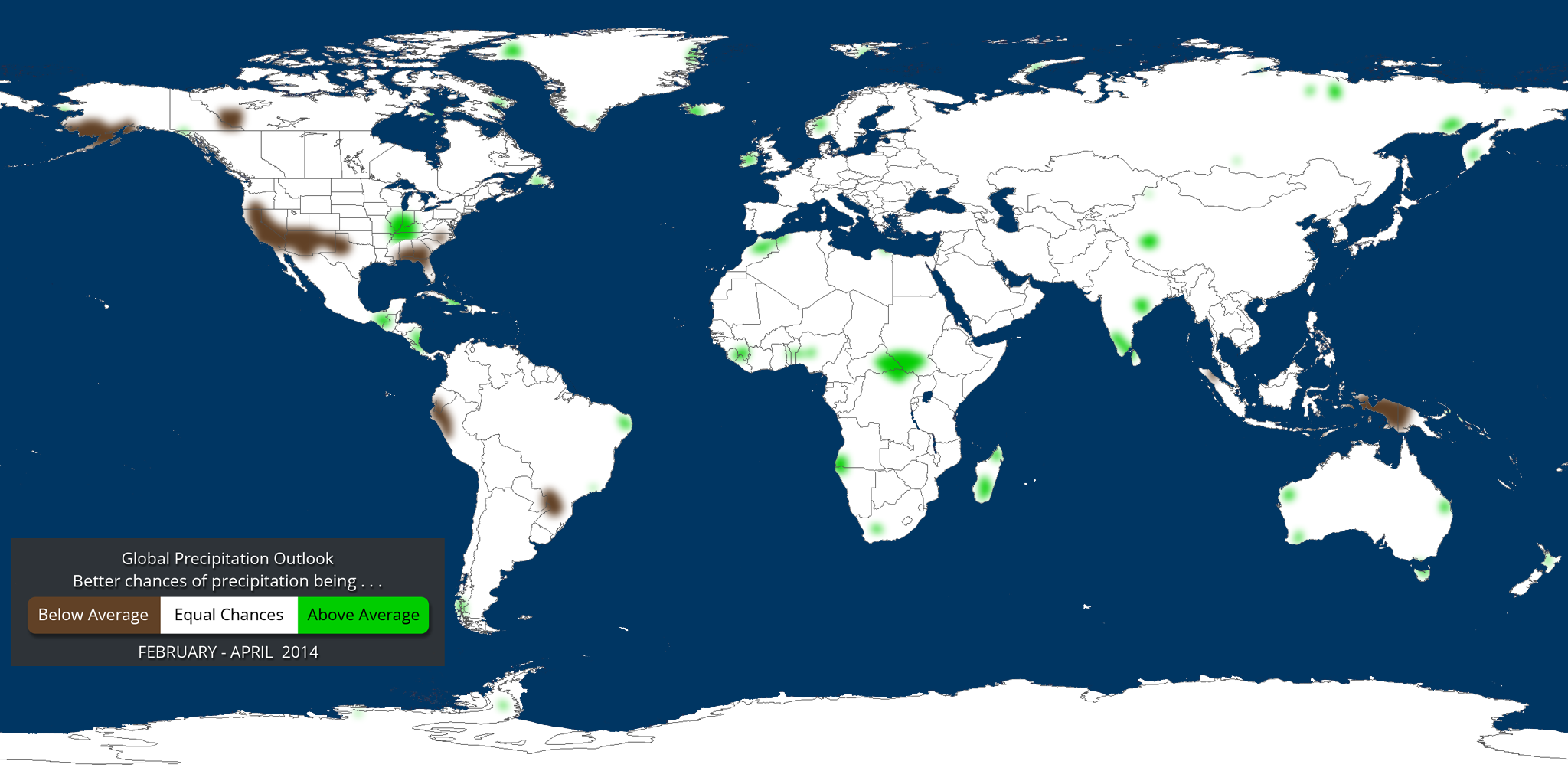
Precipitation Outlook
Dataset Name: 20140122 EarthNow: Global Precipitation Outlook (Feb – Apr 2014)
- What does GREEN mean on the map? The green shading on the map indicates areas that have a higher probability (greater than 35%) of being “wetter than normal”, than “drier than normal”, or “normal”.
- What does BROWN mean on the map? The brown shading on the map indicates areas that have a higher probability (greater than 35%) of being “drier than normal”, than “wetter than normal”, or “normal”.
- WHITE indicates areas that have a higher probability of being “normal” than “drier/wetter than normal” and also areas where the chances for being drier than normal, wetter than normal, and normal are equal.
- It should be noted that areas in the “wetter than normal” region may still have drier than normal days, and may not be “flooded”. This outlook only suggests that after the three months are over, those areas in the “wetter than normal” region are more likely to have experienced wetter than normal average rainfall.
Click to expand
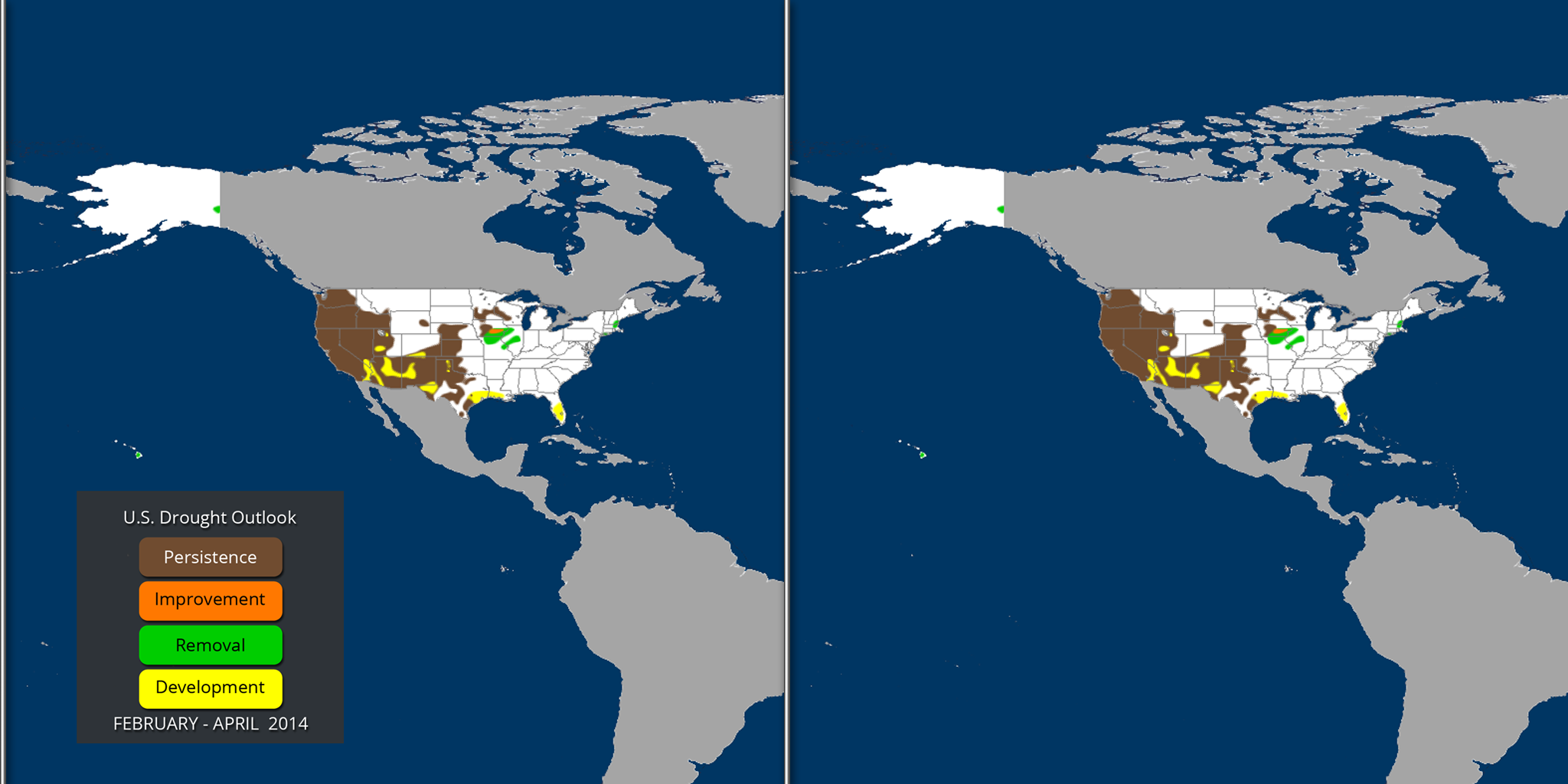
U.S. Drought Outlook
Dataset Name: 20140122 EarthNow: U.S. Drought Outlook (Feb – Apr 2014)
- This dataset shows the NOAA Climate Prediction Center (CPC) U.S. drought outlook for February – April 2014
Where do I find the datasets?
-
First, check your SOS system to make sure it’s not already in the EarthNow category.
-
If not, you can download the datasets and playlist files from this FTP Site.
-
Then download and use playlist files at the top of the page (or create your own) and make sure they are in /home/sos/sosrc or /home/sosdemo/sosrc.
-
More detailed information here
Helpful Resources for More Information
-
http://go.wisc.edu/3nd6pg National Climatic Data Center (NCDC)
-
http://go.wisc.edu/9y2618 About ENSO (El Niño/La Niña)
-
http://go.wisc.edu/1nx2n3 NCDC’s Global Climate Report
-
http://go.wisc.edu/u7632r About IRI seasonal forecasts
-
http://go.wisc.edu/wuvjkc About IRI seasonal forecast verification
-
http://go.wisc.edu/679k22 IRI seasonal forecasts


