 SOS Playlists
 SOS Playlist
 SOS AutoRun/Audio Playlist
Overview
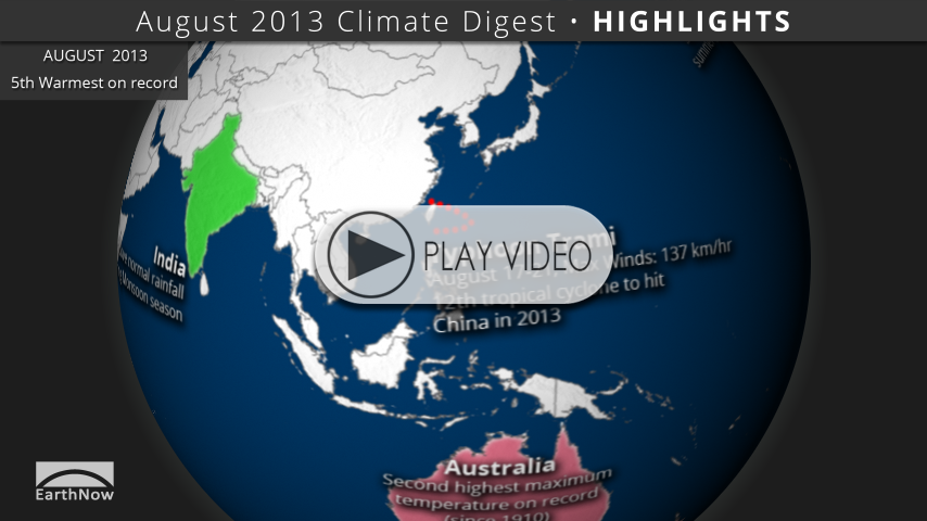
Each month, we will provide information regarding the previous month’s climate. Overall, preliminary data analysis suggests that August 2013 was tied with August 2005 as the 5th warmest on record (since 1880). Major stories include Typhoon Trami, a warmer than normal Australia, and the continued absence of El Niño or La Niña.
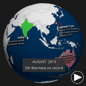
Highlights Preview • Click to play
Highlights Dataset
Dataset: 20130920 EarthNow: August 2013 Highlights
Dataset: 20130920 EarthNow: AUDIO August 2013 Highlights
 Full Map Image
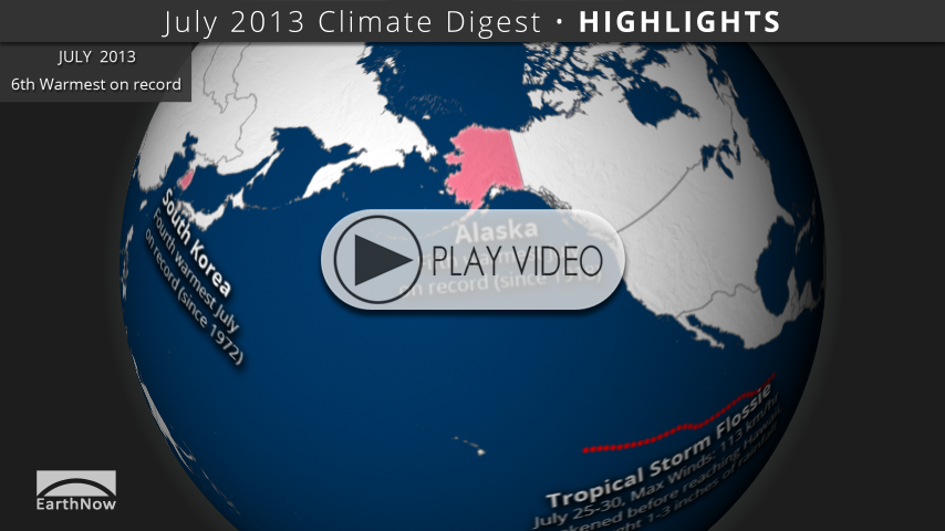
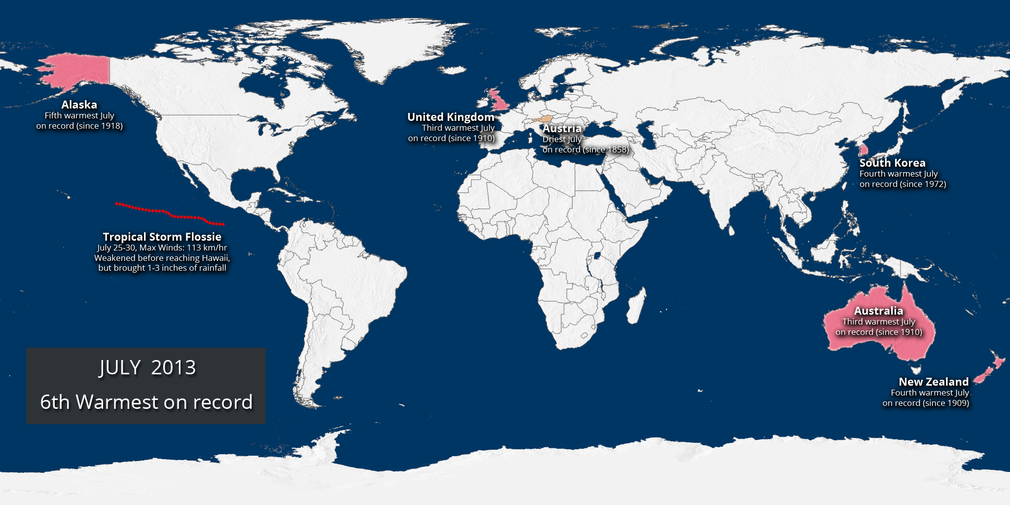
- This dataset shows some of the major August weather and climate highlights from the National Climatic Data Center’s (NCDC) monthly global climate analysis, and serves as an overview of what can be discussed in the datasets that follow. Highlights are noted below with more information.
- Alaska: Second warmest summer since 1918
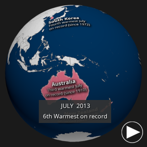
- Australia: Second highest maximum temperature for August on record (since 1910)
- New Zealand: Warmest August and winter season on record (since 1909)
- Typhoon Trami: August 17-21, Max. winds: 137 km/hr; 12th tropical cyclone to hit China in 2013.
- India: During the 2013 Asian Southwest Monsoon season to date, India received 110% of the 1951-2000 average rainfall.
- Germany: With only 79% of the 1981-2010 average rainfall, Germany observed its driest summer since 2003.
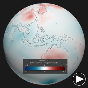
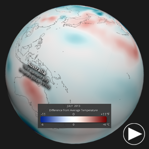
Global Temperature Differences • Click to play
Global Temperature Anomalies Dataset
Dataset: 20130920 EarthNow: August 2013 Temperature Anomaly
Dataset: 20130920 EarthNow: AUDIO August 2013 Temperature Anomaly
Full Map Image
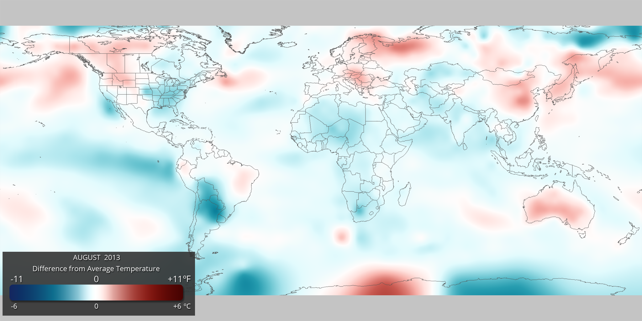
- Using the real-time Monthly Temperature Anomalies dataset is a great way to convey where some of the warmer and cooler than average areas were in August, including those mentioned above in the highlights.
- The combined global land and ocean average surface temperature for August was tied with 2005, as the 5th warmest on record (since 1880).
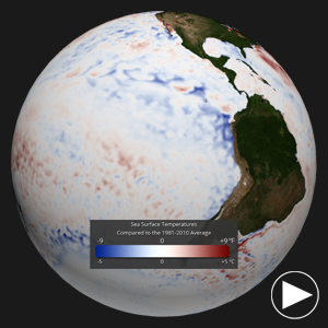
SST Anomalies • Click to play
Sea Surface Temperature Anomalies Dataset
Dataset: 20130920 EarthNow: August 2013 SST Anomaly
Dataset: 20130920 EarthNow: AUDIO August 2013 SST Anomaly
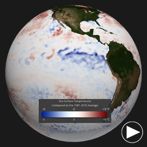
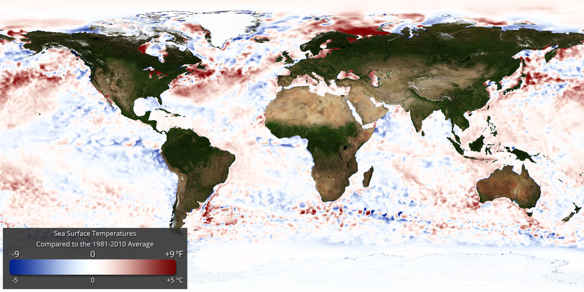
- The real-time sea surface temperature anomaly dataset is a great way to visualize the El Niño – Southern Oscillation (ENSO) cycle in the eastern tropical Pacific ocean. For August 2013, these waters were only slightly below average, indicating an ENSO Neutral period. The Climate Prediction Center anticipates a continued neutral period through at least the northern hemisphere Winter.
- Also of note, the global ocean temperature for August tied with 1998, 2003, 2005, and 2009 as the record highest for August.
- Remember that the blues indicate cooler than average temperatures and reds indicate warmer than average temperatures (white: average).
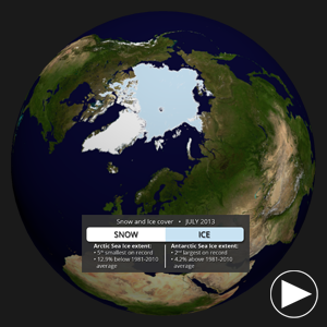
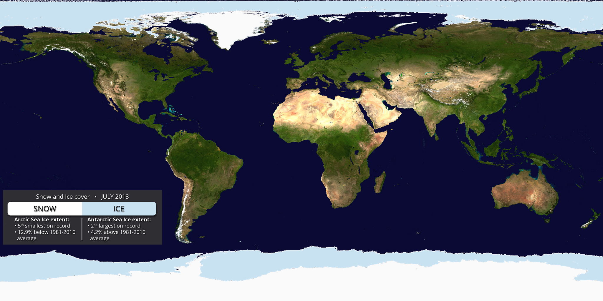
Snow and Ice • Click to play
Snow and Ice Cover Dataset
Dataset: 20130920 EarthNow: August 2013 Snow and Ice Cover
Dataset: 20130920 EarthNow: AUDIO August 2013 Snow and Ice Cover
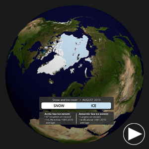
- Aside from helping to illustrate seasonal changes, the real-time Snow and Ice Cover dataset is a great way to convey sea ice change through time, including discussing how the current sea ice extent compares to other noteworthy years.
- The Arctic sea ice extent in August was the sixth smallest on record. The extent was 15.7% below the 1981-2010 average.
- In Antarctica, the sea ice extent was the largest on record, at 4.5% above the 1981-2010 average.
Where do I find the datasets?
-
First, check your SOS system to make sure it’s not already in the EarthNow category.
-
If not, you can download the datasets and playlist files from this FTP Site.
-
Then download and use playlist files at the top of the page (or create your own) and make sure they are in /home/sos/sosrc or /home/sosdemo/sosrc.
-
More detailed information here
Helpful Resources for More Information
-
http://go.wisc.edu/3nd6pg National Climatic Data Center (NCDC)
-
http://go.wisc.edu/9y2618 About ENSO (El Niño/La Niña)
-
http://go.wisc.edu/1nx2n3 NCDC’s Global Climate Report


