SOS Playlists
 SOS Playlist
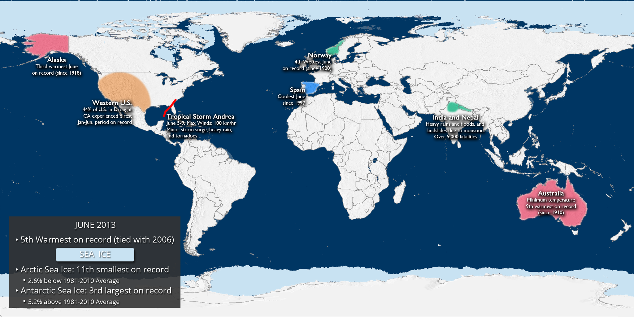
Overview
The data for the global temperature and precipitation outlooks are provided by the International Research Institute for Climate and Society (IRI). The IRI was established as a cooperative agreement between NOAA’s Climate Program Office and Columbia University. It is part of The Earth Institute, Columbia University. The data for these maps are constructed primarily from several climate models, with some minor tweaks by climatologists.
Temperature Outlook
Temperature Outlook
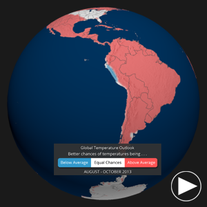
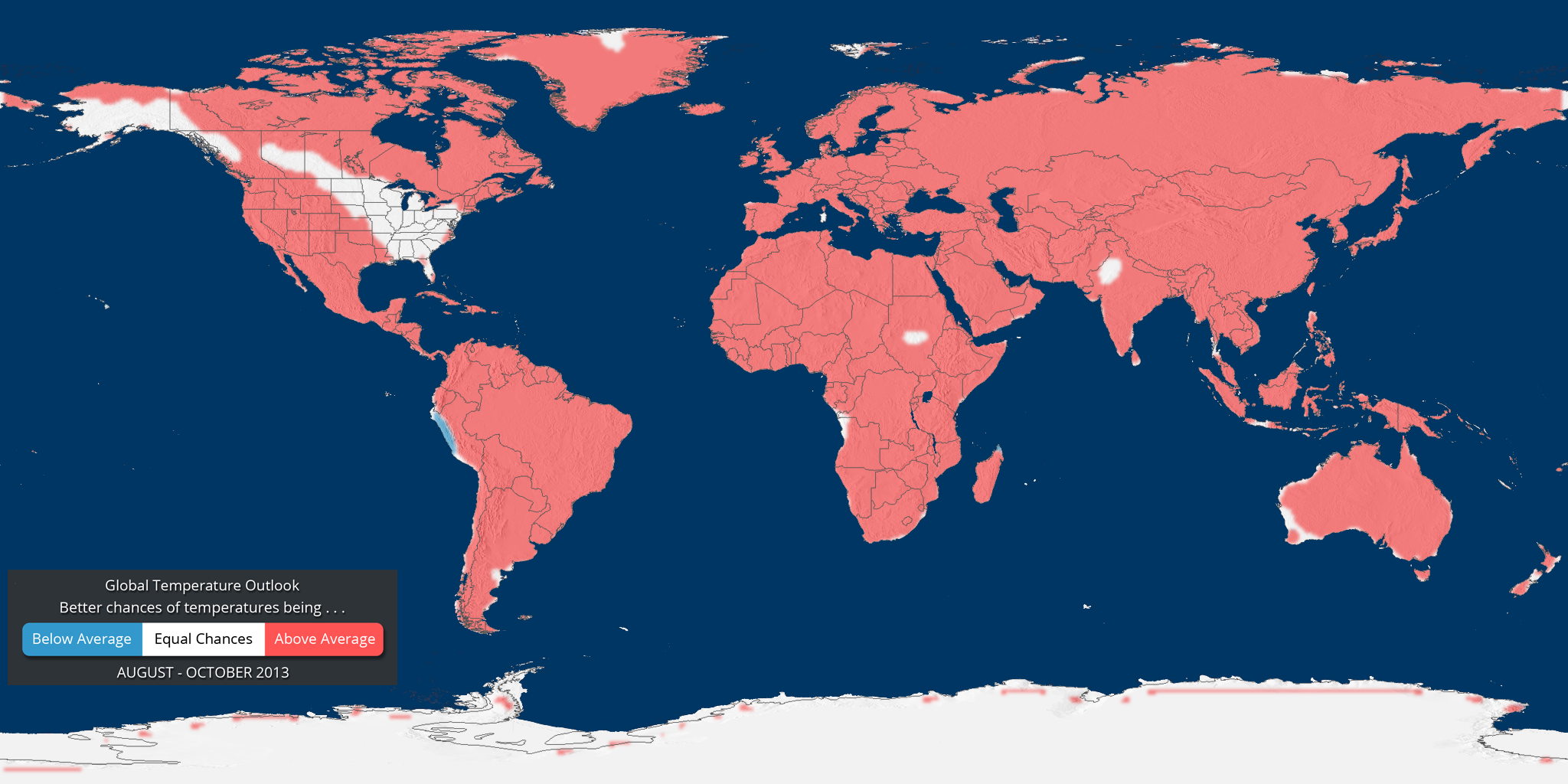
Dataset Name: 20130726 EarthNow: Global Temperature Outlook (August-October 2013)
 Still Map Image
- What does RED mean on the map? The red shading on the map indicates areas that have a higher probability (greater than 35%) of being “warmer than normal”, than “cooler than normal”, or “normal”.
- What does BLUE mean on the map? The blue shading on the map indicates areas that have a higher probability (greater than 35%) of being “cooler than normal”, than “warmer than normal”, or “normal”.
- WHITE indicates areas that have a higher probability of being “normal” than “cooler/warmer than normal” and also areas where the chances for being cooler than normal, warmer than normal, and normal are equal.
- It should be noted that areas in the “warmer than normal” region may still have cooler than normal days, and may not be “hot”. This outlook only suggests that after the three months are over, those areas in the “warmer than normal” region are more likely to have experienced warmer than normal average temperatures.
Precipitation Outlook
Precipitation Outlook
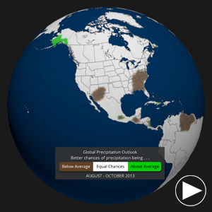
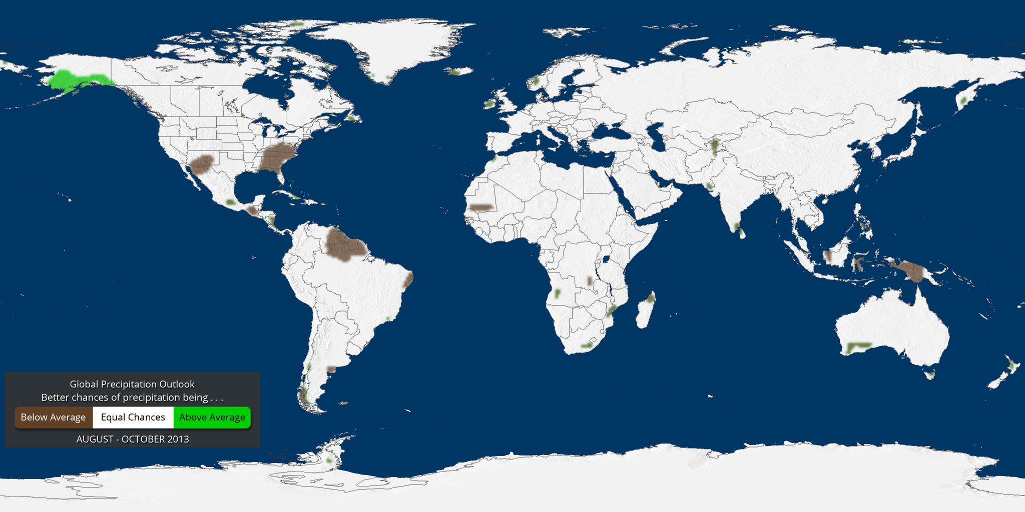
Dataset Name: 20130726 EarthNow: Global Precipitation Outlook (August-October 2013)
Still Map Image
- What does GREEN mean on the map? The green shading on the map indicates areas that have a higher probability (greater than 35%) of being “wetter than normal”, than “drier than normal”, or “normal”.
- What does BROWN mean on the map? The brown shading on the map indicates areas that have a higher probability (greater than 35%) of being “drier than normal”, than “wetter than normal”, or “normal”.
- WHITE indicates areas that have a higher probability of being “normal” than “drier/wetter than normal” and also areas where the chances for being drier than normal, wetter than normal, and normal are equal.
- It should be noted that areas in the “wetter than normal” region may still have drier than normal days, and may not be “flooded”. This outlook only suggests that after the three months are over, those areas in the “wetter than normal” region are more likely to have experienced wetter than normal average rainfall.
Where do I find the datasets?
-
First, check your SOS system to make sure it’s not already in the EarthNow category.
-
If not, you can download the datasets and playlist files from this FTP Site.
-
Then download and use playlist files at the top of the page (or create your own) and make sure they are in /home/sos/sosrc or /home/sosdemo/sosrc.
-
More detailed information here
Helpful Resources for More Information
-
http://go.wisc.edu/3nd6pg National Climatic Data Center (NCDC)
-
http://go.wisc.edu/u7632r About IRI seasonal forecasts
-
http://go.wisc.edu/wuvjkc About IRI seasonal forecast verification
-
http://go.wisc.edu/679k22 IRI seasonal forecasts


