Overview
The data for the global temperature and precipitation outlooks are provided by the International Research Institute for Climate and Society (IRI). The IRI was established as a cooperative agreement between NOAA’s Climate Program Office and Columbia University. It is part of The Earth Institute, Columbia University. These maps are constructed primarily with data from NOAA climate models, with some minor tweaks by climatologists.
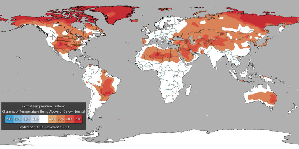
Temperature Outlook
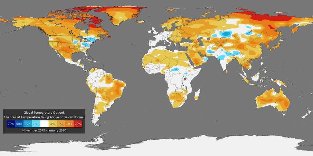
- What does RED mean on the map? The red and orange shading on the map indicates areas that have a higher probability (greater than 35%) of being “warmer than normal”, than “normal”, or “cooler than normal”.
- What does BLUE mean on the map? The blue shading on the map indicates areas that have a higher probability (greater than 35%) of being “cooler than normal”, than “normal”, or “warmer normal”.
- WHITE indicates areas that have a higher probability of being “normal” than “cooler or warmer than normal” and also, areas where the chances for being cooler than normal, warmer than normal, and normal are equal.
It should be noted that areas in the “warmer than normal” region may still have cooler than normal days, and may not be “hot”. This outlook only suggests that after the three months are over, those areas in the “warmer than normal” region are more likely to have experienced warmer than normal average temperatures.
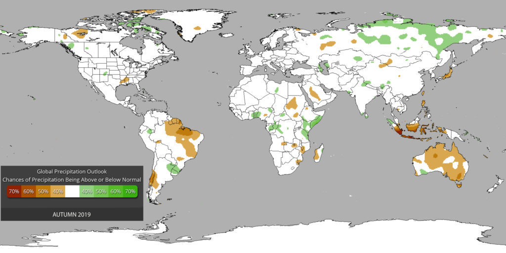
Precipitation Outlook
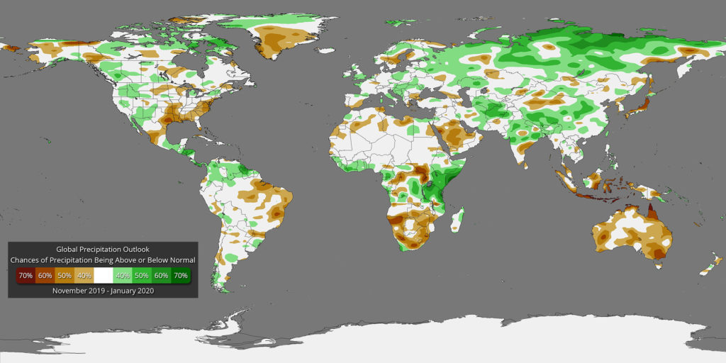
- What does GREEN mean on the map? The green shading on the map indicates areas that have a higher probability (greater than 35%) of being “wetter than normal”, than “normal”, or “drier than normal”.
- What does BROWN mean on the map? The brown shading on the map indicates areas that have a higher probability (greater than 35%) of being “drier than normal”, than “normal”, or “wetter than normal”.
- WHITE indicates areas that have a higher probability of being “normal” than “drier or wetter than normal” and also, areas where the chances for being drier than normal, wetter than normal, and normal are equal.
It should be noted that areas in the “wetter than normal” region may still have drier than normal days, and may not be “flooded”. This outlook only suggests that after the three months are over, those areas in the “wetter than normal” region are more likely to have experienced wetter than normal average rainfall.